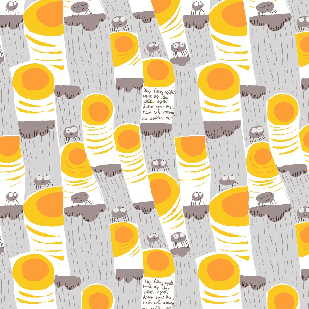
Itsy Bitsy Sneak Peek....
I get a lot of questions about why I don't design prints for boys. Its not so much that I make a decision not to, it's just that I find drawing artwork for them a bit tougher. And I always seem to want to use the hottest, sharpest pinks, which doesn't make it any easier. I am so pleased to report that there is at least one print in my upcoming line for Kokka that will work for a baby boy's nursery (maybe two, if the pink piggies aren't too off-putting). And I'll admit it, it happened sort of accidentally.
I set out to design a print around the Nursery Rhyme "Itsy Bitsy Spider", which was one of my babies first favorites. I wanted the composition to have that same "up and down" feel that the song does, and I wanted my spider to be chubby (yet itsy bitsy) and mostly eyeballs, so that he wouldn't freak anybody out. I've been obsessed with the combinations of citron and yellow against taupe and gray, which, turns out, is a prety perfect little boy color story. The results are below. Give it to me straight, would you put this print in your baby boy's room?
This print is the first of several that I have developed recently that began with solving the puzzle of composition and repeat rather than with an illustration or character. The surprising lesson here, for me, was that this is a great way to build a print that feels more graphic and geometrical, and as a result, more fit for boys. I'm curious to know what you all think....
And if you want to learn more about my method of fabric design, we still have two spots left in the second Photoshop for Fabric Design workshop in New York in April. You need not be an expert in Photoshop to take this workshop, we use only the simplest tools within the application and everyone will work on their own designs at their own pace.
Now back to those chubby, soggy spiders....

